Fanta Unifies its Visual Identity Globally and its New Image
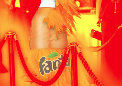
Fanta has recently presented a new visual identity with which it seeks to unify its image in all the markets in which it is present and give consistency to its brand, comparing itself to other insignia of The Coca-Cola Company. The aim of the update has been to bring a more playful tone to the brand, reinforce its bold and iconic character and improve its recognition around the world.
The identity revamp has been carried out, according to AdAge, by Coca-Cola’s global design team in collaboration with branding agencies and design studios Jones Knowles Ritchie, Everything is Relative and Gretel. The change coincides with the reformulation of Fanta’s best-selling orange flavor, which has also designed what the company has described as the biggest Fanta marketing campaign in North America in more than a decade.
The new image is an update of the one implemented in 2017 in a large part of the European markets, including the United Kingdom or Spain. However, in the United States the new logo will replace the existing one since 2010, and which was characterized by a more classic and rounded letter. Instead, Fanta will now have a more rectangular and modern typeface, with which it seeks to highlight the name of the brand. This, furthermore, is supported by an aesthetic of the pop speech bubble that communicates spontaneity and topicality, elements that reinforce the objectives of the brand.
In addition, the new logo is characterized by abandoning the green leaf located at the top of the name and which identified Fanta with the orange flavor. The objective of this is to avoid consumer confusion regarding the identification of the different flavors of the soft drink, and to highlight the variety of these. Thus, now the expression of the logo on the brand’s packaging will be accompanied by some cheerful illustrations of drops, a new palette of vivid colors and representations of the different fruits that originate the flavors, created by the Brazilian artist Lucas Wakamatsu.
The objective of the brand, however, is to appeal to a broader audience and not only to young people, and to bring its fun personality to all segments. “Probably the age group that needs the most fun in their lives are adults and young adults,” said Rapha Abreu, Global Vice President of Design at Coca-Cola, according to the aforementioned media. “We want to inject joy into their lives.”
Bu gönderiyi Instagram’da gör
Reviewer overview
Fanta Unifies its Visual Identity Globally and its New Image - /10
Summary
Fanta has recently presented a new visual identity with which it seeks to unify its image in all the markets in which it is present and give consistency to its brand, comparing itself to other insignia of The Coca-Cola Company.
0 Bad!